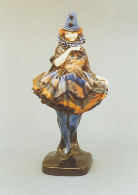
 An early colourway of Pierette
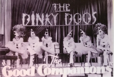
The 1920s and 1930s were the age of the Pierrot. In 1923 Gertrude Lawrence sang Parisian Pierrot in Noël Coward’s revue ‘London Calling’, during the same era JB Priestly wrote a popular book about a Pierrot concert party called The Good Companions with the late Sir John Gielgud as the romantic Lead and there was even a Pierrot themed variety show which ran for 500 performances between 1921-1926.
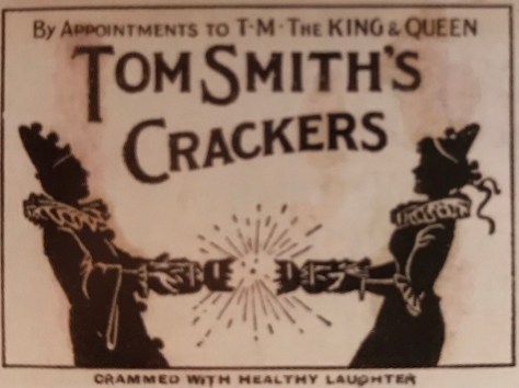
Yet, it wasn’t just on stage that this phenomenon could be seen. During this time advertising was littered with Pierrots extolling the virtues of particular brands including Tom Smith’s crackers and even Kiwi Boot Polish, which even today is a brand we may be familiar with.
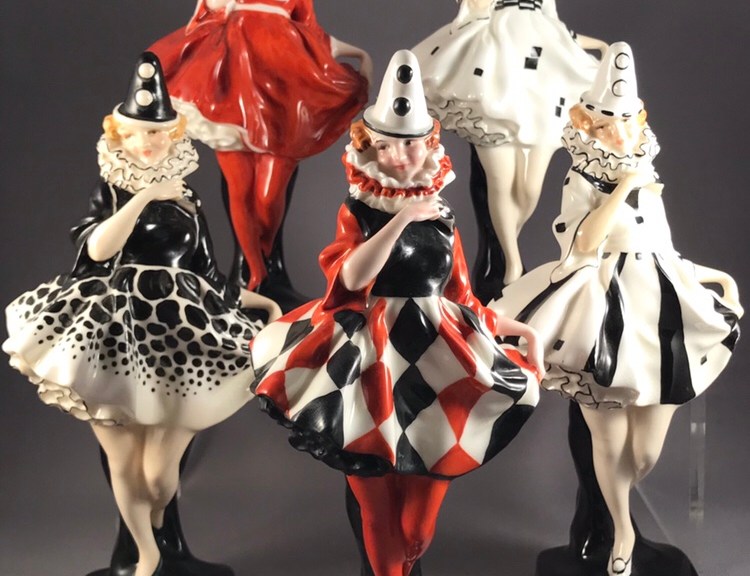
Royal Doulton naturally cottoned on to this trend and their then leading modeller, Leslie Harradine, certainly had his finger on the pulse of this popular trend with his wonderful study Pierette.
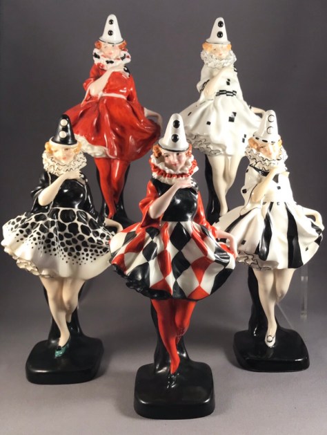
HN 731, 642, 643, 644 and 721.
Originally introduced as an 18cm Figure (model 445) and available in no less than eight different colourways, she was later introduced in a larger size in earthenware as HN 1391 (1930) and again later as HN 1749 (1936) and measuring 23cm. There is a lesser known third version of Pierette, this time in miniature. Never officially produced as part of the HN or M collections, she occasionally turns up to delight collectors. A most unusual flambé version of the miniature Pierrette has also been found.
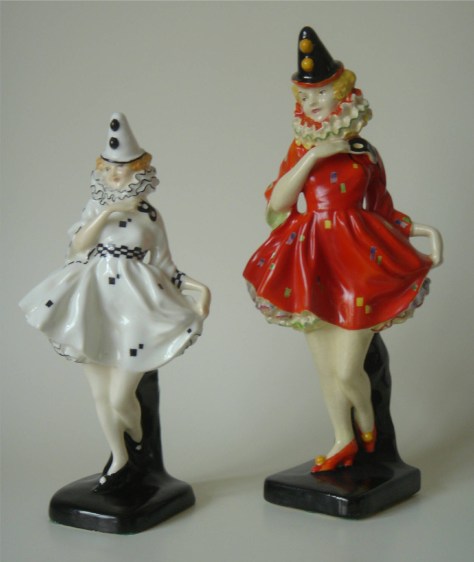 Versions 1 and 3 HN 644 and 1391
As with all Royal Doulton figures the shorter the production run, the more sought after the figure today. Although HN 644 eventually turns up the other colourways and sizes of her are more difficult to find.
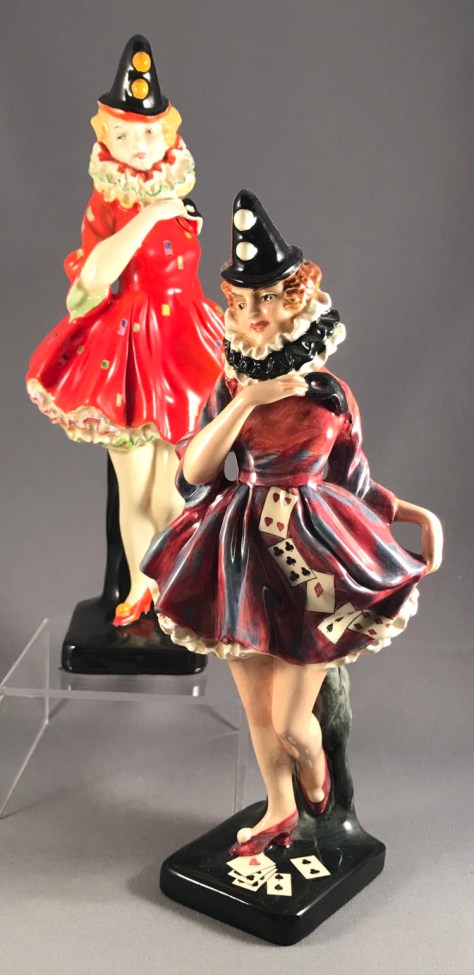 HN 1391 and 1749
Happy hunting!
For those interested in the origins of Royal Doulton figures I can recommend Reflections by Jocelyn Lukins and Christopher Evans.
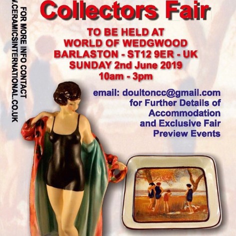
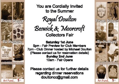 Just one week to go til the event of the summer June 2nd #FromPotteryToPaper Fair and Exhibition at World of Wedgwood!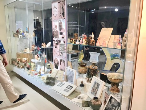
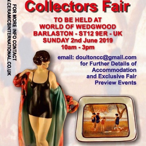
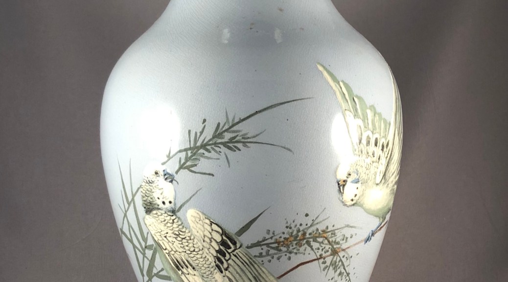
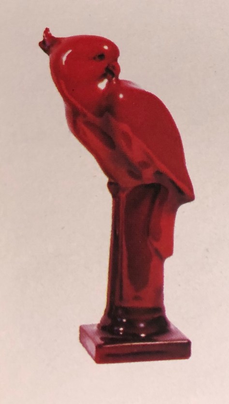

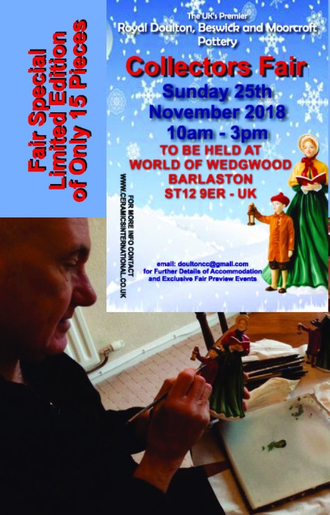
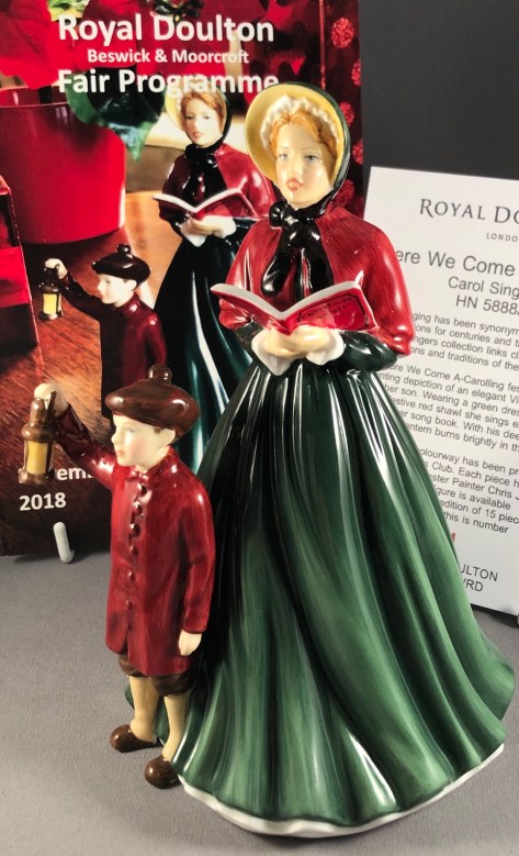
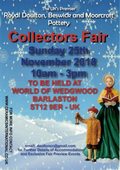 Don’t forget to mark the date in your calendars!